OH NO!
This page appears to be missing...
What are you looking for?
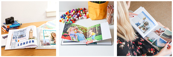
How about Canvas Prints?
Still not sure? Just head back to our Home Page.
Thanks!
This page appears to be missing...
What are you looking for?
How about Canvas Prints?
Still not sure? Just head back to our Home Page.
Thanks!

OUR PRODUCT RANGE IS BIGGER AND BETTER THAN EVER

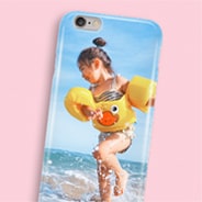
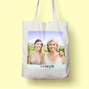

PHOTO MUGS • TOTE BAGS • JIGSAW PUZZLES • FRAMED PRINTS • PHOTO MAGNETS T-SHIRTS • CUSHIONS • DESKTOP PLAQUES • SERVING TRAYS • PERSONALISED_TAGS • PHONE CASES • GREETING CARDS • AND MORE...
ALBUMWORKS HAS A RANGE OF GIFT IDEAS, PERFECT FOR ALL MOMENTS IN LIFE - NO MATTER HOW BIG OR SMALL. EXPLORE THE NEW GIFT RANGE TODAY.
SPECIAL OFFERS, SOFTWARE UPDATES + MORE!
DON’T WANT TO MISS OUT? YOU DON’T HAVE TO! SIGN UP TO RECEIVE OUR NEWSLETTER,
EXCLUSIVE OFFERS AND PROMOTIONS. GUARANTEED GREAT DEALS ON PHOTO BOOKS!


Be the first to know about exclusive deals, new products, and more. Enter your details below to get your discount code!