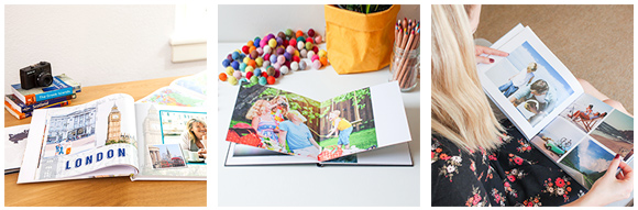
Choosing layouts for your photobook
JANUARY 1ST, 2000
One person's stunning design, is another’s "not my cup of tea". Every photobook is individual and so is your sense of layout and design. Some of us prefer clean, contemporary design, and others a traditional aesthetic. It’s your book and you are the only critic you need to please.
So take these tips as opinion rather than rules - you are the best judge.
Picking your templates
The photobook editor has a whole variety of templates to get you started. You can use these or do your own thing or even create your own page layout templates.
When you pick a template - view each photo book double page spread as a whole rather than two isolated pages.
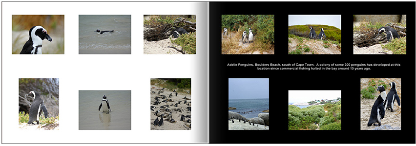
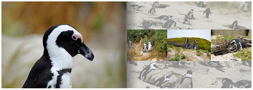
For example you could use a full page image on the left hand page and perhaps four shots on the right hand page against a solid background colour. The right hand page can add detail and meaning to the shot on the left hand side.
For example you may have a shot that means the most to you but a variety of other shots which individually may not be stunning photos but collectively they add a lot of flavour and context to what you saw on that day. The two pages viewed together as a single element tell a more complete story of that day and make best use of your favourite shot.
in fact one of the key lessons in layout in design that less is often more. You can draw greater attention or achieve greater impact with less content rather than more. Consider these two alternate layouts. Which one makes the greater impact on you, which layout has the most drama?
Layout 1
Layout 2
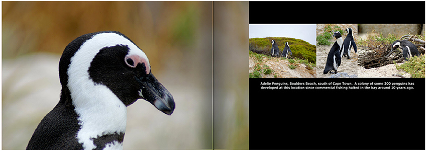
OK, so layout 2 only used 4 photos and misses out on a heap of shots that you took that afternoon, but the sense of involvement in the content, is so much greater.
Use visual effects to draw your eye to the photo
The Editor has a range of features that can make a significant difference to how a photo is emphasised on the photo book page by adding small visual techniques. This little piece of emphasis can make a big difference to how the eye is dragged to a photo.
One of the most effective tricks is to use a drop shadow on photos. This creates a really effective illusion where the photo appears to lift off the photobook page and brings the photo into the foreground.
Similarly on a black background, experiment with placing a white border around the photos to quarantine the colour in your photo from the black and draw the eye to the photo. Photos with white border applied
The opposite technique works just effectively. Try placing a black border around each photo when on a white or light coloured background. This creates separation between the photo and other visual elements on each page of your photo book.
Experiment with backgrounds
A photo can be used as a background to a photobook page to provide more context for the ther photography. When you do this, use the arrange option to send it to the back and drop the opacity of the background image (40%-50% is a good level) so that it doesn’t fight with the photos in the foreground.
And if you aren't sure, give the albumworks Customer Service team a call on 1300 553 448, they can give you a few more ideas around page layout in your photobook.