Search
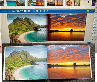
Will my printed photo book look the same as it does on my screen?
No, your printed photo book may look slightly different to how it appears on your screen, and that’s completely normal. This is due to natural differences between how colours are displayed on screens and how they're reproduced in print. It’s not unique to albumworks — it’s simply a natural part of the printing process.
Why there’s a difference between screen and print:
The main reason is how colours are created:
Screens use light: Monitors display colour using RGB (Red, Green, and Blue) light, which can appear more vivid and bright than printed colour.
Printing uses ink: Ink on paper blends differently and can't reproduce the full brightness or colour range of your screen. Printing uses CMYK (Cyan, Magenta, Yellow and Black) which has a more limited colour gamut than RGB screens.
Brightness settings matter: Many screens are set to high brightness by default, so your printed product may appear darker than expected.
Despite these differences, we take great care to produce beautiful, vibrant prints. Our professional printers are colour-calibrated daily, and our print profiles are finely tuned to deliver natural skin tones and rich, true-to-life colours.
Want a closer match to what you see on screen?
If you're interested in calibrating your monitor to match our print output, we’re happy to help. We can send you a set of 8x6" printed samples along with the digital file used, so you can compare and adjust your screen settings.
To request samples, contact our customer service team. Let us know your postal address and we’ll send them out straight away.